It’s no secret that Britain’s wealth is concentrated in London and the Home Counties of England. Almost every borough in Greater London ranks highly for house prices and the general cost of living. There is good reason why campaigners call for a separate wage rate in the capital.
And yet a great swathe of the less well-off parts of London are earning wage rates below those of residents living in some of the poorest parts of northern England. In Enfield, an outer London borough which ranks high on the list for house prices, the poorest quarter of employees are now, according to provisional ONS data for 2020, earning less each week before tax than the poorest quarter of employees living in Burnley, Lancashire – the second most affordable place in the country to live.
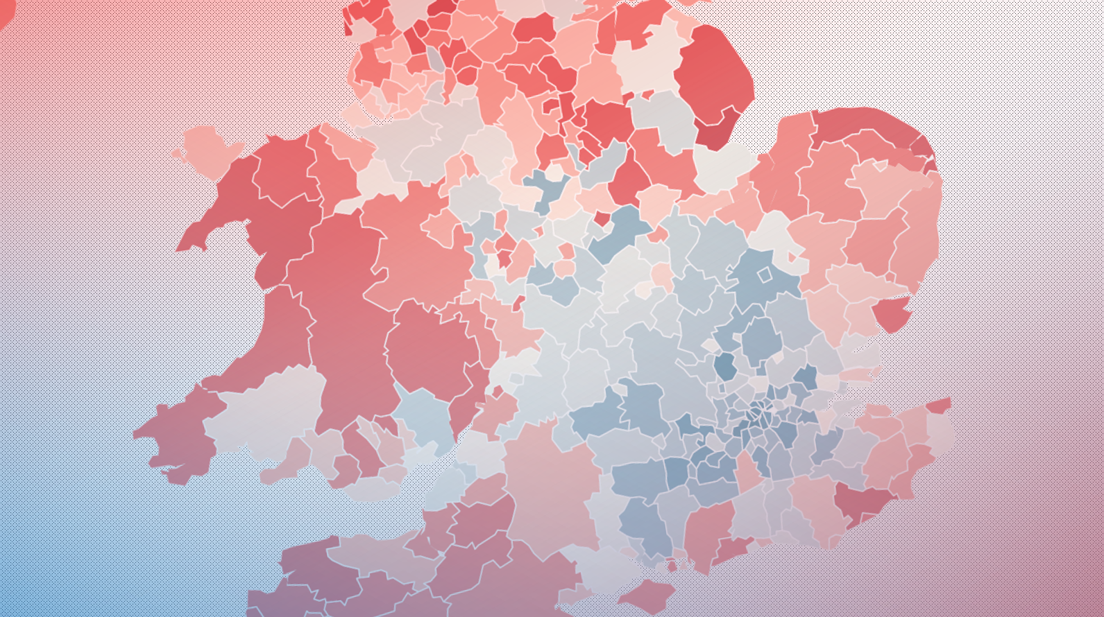
As always, generalities and averages obscure important features in the margins. For example, if you map gross weekly wages for the median British employee – by place of residence – you’ll see how, in general terms, wealth and opportunity are best found south of Birmingham, and within the London commuter belt. People living in major cities outside London also tend to have higher median wages than those in rural or coastal communities.
But a close look at the ONS data shows the UK’s inequality cannot be simply reduced to north versus south, or city versus country. In some cases, a two-minute Tube ride is all that separates the very rich from the very poor.
A useful way of thinking about this is by considering Britain’s “bottom quarter”. The ONS estimates that in 2020 there were around 26 million employees in the country; the bottom quarter are the lowest-paid 25 per cent of that workforce.
For the country at large, the median wage for those on the 25th percentile is £302.20 a week before tax. That is nearly two thirds (63.1 per cent) of what the median employee makes, but well under half (41 per cent) of what the worst-paid member of the top quarter makes.
In somewhere like Enfield, this inequality is a lot more magnified. The 25th percentile of employees living in the borough last year made just 54 per cent of the local median, and only 34 per cent of what the top quarter was earning. Enfield’s bottom quarter earn £265.30 a week (or less) before tax. In Burnley – a borough almost a world away from Enfield in terms of house prices and living standards – the bottom quarter of employees earn £289.20 or less each week.
The problems of being poor in a rich area stretch beyond paying for housing. Shops sometimes set their prices to suit the local capacities of the median worker, while the mix of shops in an area reflect local purchasing power (pricier convenience stores are more common in urban spaces, for example).
Enfield is not an isolated example. The Conservative-voting suburban locales of Sevenoaks in Kent and Amber Valley in Derbyshire, for example, display levels of inequality even greater than those in the London borough.
In real terms, St Albans ranks top of all the local councils that have decent data for inequality: the employee-based gap between the top and bottom quarter is more than £810 a week. For the UK as a whole, the gap is almost half that, at £426 a week.
None of this means it is wrong to point out there is general inequality between, say, London and the urban north. Burnley, Blackburn and Hyndburn are just some of the many “left behind” parts of Britain that politicians are seeking to tease out from a long-term economic depression. But stark inequality exists at local as well as national level – more than most realise – and needs to be part of the conversation, too.
Mapped below is the gap between each local authority’s respective bottom quarter and top quarter of earners, exposing geographical patterns that don’t necessarily complement the common stereotypes.
Canterbury (Kent), Broadland (Norfolk), Conwy (north Wales) and Copeland (Cumbria) – among the places with the highest local inequality – differ in terms of their economy, culture and community. Each votes differently and has a distinctive outlook on the state of the world. Yet the gap between the less well-off and best-off is just as high in each.
Inequality doesn’t correlate well with employee-based wage rates. Some of the highest levels of inequality are in both the poorest and richest boroughs in the country. While some poor boroughs feature high levels of inequality, others don’t.
What does this mean for policymaking, if we want to reduce widening levels of inequality and opportunity, and bring local housing more in line with local wages? In short: poverty and inequality in Britain is complex, and our policy response needs to fit that complexity.
Sloganeering about “left-behind” towns might win votes in red-brick northern England, but isn’t close to a sufficient response when it fails to account for the white-brick inequalities of southern England, too.


